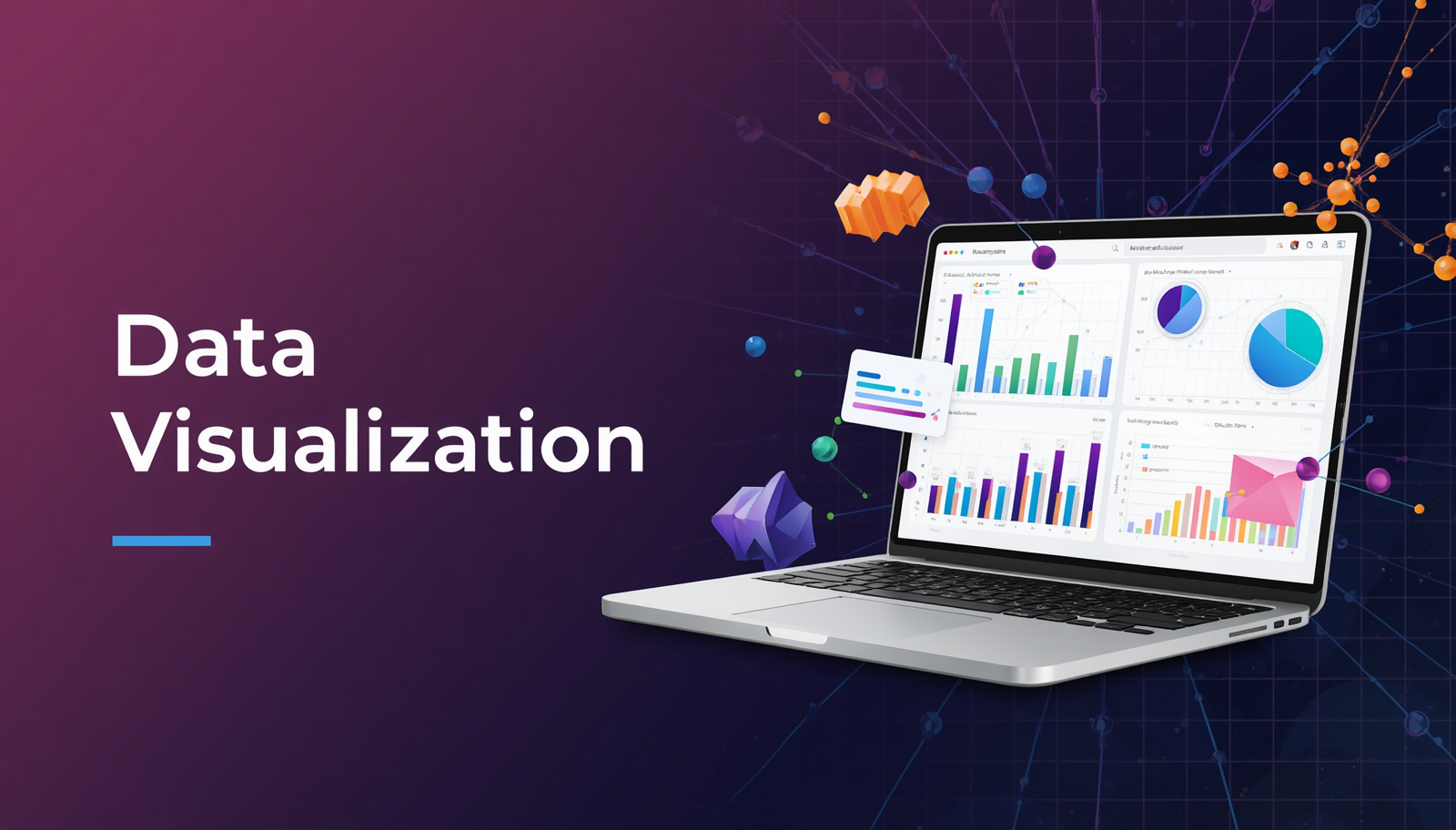
Data Visualisation
0.0
|
intermediate
|
Data Visualisation
Learn to read, build, and tell stories with data using Python and spot when a chart is lying to you.
Innovators (Ages 14-17) (Age Group)
|
0 Sessions
What You'll Learn
- Read and critically evaluate any chart or graph and spot when one is deliberately misleading
- Choose the right chart type for a given dataset and question
- Build bar charts, line charts, scatter plots, histograms, box plots, and heatmaps using Python
- Explore real-world datasets on global health, happiness, and economic trends
- Tell a data-driven story with charts, narrative, and clear conclusions
- Present your analysis confidently to an audience
What You Will Build
You will work through eight modules, each adding a new tool to your visualization toolkit. By the end, you will produce a complete data story notebook, a polished, documented Jupyter Notebook that presents a real finding from real data, told entirely through visualisations you built yourself. You will also build a personal collection of charts spanning distributions, comparisons, relationships, and multivariable analysis, all using Python.
Why This Course
Every major decision in the world today — in government, business, sport, health, and technology — is informed by data. But raw data is almost impossible to understand without visualisation. This course teaches you to see data: to look at a dataset, find the patterns, ask better questions, and communicate what you discover. Half of what you learn here is visual thinking — understanding what makes a chart honest or deceptive — skills that apply far beyond data science.
Tools & Technologies
Google Colab
Pandas
Python 3.x
Matplotlib
100
credits per session
TOTAL
0 Credits
0 Sessions
Create an account to access full course details and start learning